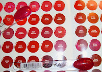
My camera isn't perfect, so the swatches may not all be true to color. BUT often i've looked at swatches of colors and wished there were more so I get a better idea of the color, so I offer up my camera's point of view. For the comparisons of spoons to swatch, I have the spoon touching the swatch color. I don't have all of them because for some, the color was just way too off. Also, comparisons are just that, to show you how different they are, not to necessarily show what the color is exactly like. Overall, it looks like the colors are closer to the color shown on the border of the swatches- where they're darker.
I wanted to dig out the three spoons I got last time to compare to the three new light pinks that I got but somehow I've lost them.
This is just a picture of everything so that you can see how they compare.
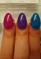
The three modmatte colors are AMAZING. I love the bright fun pop of color, it's perfect for summer. If I liked mattes, I might have to seriously consider these. Phoebe has a slight shimmer to it.
These provide alternate views and may be closer to the brightness.
Reva isn't as dark as it looks in the picture, it looks more like the darkness of Kimmy, and Kimmy irl is a much more brighter color because of the glitter. Apple is more yellow.
Sookie is a bright red while Tamsen has a touch of brown so its a brick red like color. As we all know, my camera can't pick up purple, it turns it bluer. So therefore Kieko, Areej, and Mira are more pink in real life. I'm looking for a red, but I don't these are the ones. I put in an order for another batch of color spoons that are red. I saw a picture in which a friend had a red with a hint of orange. I usually shy away from those, but this was a brighter polish so it didn't look dull or odd. It looked fantabulous.
Another look at the Intimate's collection, this time I tried to get the shimmer in Gemma. Again, this should be a bit more purple than blue.
Delilah: I really wanted this swatch spoon because from the swatches I've seen it looks like a clear red where you can see the glitter through,and I thought that was a really cool effect. The red is a brighter red than the pic above, but it's still a darker red. I was a bit disappointed because the glitter is finer than I imagined it and there was a considerable amount of it. I'm torn on whether or not I should buy it. I wanted a glitter dispersed through jelly effect, but this is looking a bit more like half normal glitter polish.
Mieko: Has orange and red shimmer and is brighter than the picture. It's a cool tone pink.
Zara: Cool light medium purple with yellow and orange shimmer.
Jessika, Scarlet, Laurie: These three are so sheer that they would be used for french nails. Jessika is a warm pink, Scarlet and Laurie are both cool toned with Laurie being lighter. It must take many many layers to get the colors semi-opaque. They're all warmer looking than in the pictures.
Kylie: More intense and two steps warmer than the picture. I was trying to see if it was the color I envisioned- and really want, but I think it's a couple steps too warm. It's a "brighter" pink, but still very much wearable.
Angel: Angel in the swatch is a color I adore, but Angel irl, is a lighter, warmer pink with pink iridescence.
Mia: looks like a decent color in the photo but it's a little browner in real like. It scares me a bit because it reminds me of those colors old ladies would wear when I was little. I'm sure it'd be gorgeous on people of different skin tones, but on mine it just reminds me of that too much.
Addison: It's like a darker, 1 step pinker with slight shimmer version of Mia.
Caresse: I like this color. I would like it with a little less purple and a little more pink, but I think I might buy it. We'll see. It's much pinker than the swatch (which makes it look a lot more lavender)
Do you see why I had to order the spoons? All these colors are so close it's near impossible to tell what you like from just the swatches.
Poppy: I was disappointed because I expected it to be like what the picture shows, a slightly muted orange pink color, but it's not at all. It's more pink than orange, and a lot more vibrant. So glad I didn't order the bottle without the swatch because I can't pull this off.
Cassi: warm pink with "brightness"/ "intensity", but less so than Poppy. It's like Poppy, but with yellow iridescence.
Clara: More of what I imagined poppy to be. If it were a little less muted I'd buy in a heartbeat. I'm still deciding whether or not to get it. More orange in real life
Elise: Tangerine orange. It's a beautiful color but makes me look a bit on the ashy side.
Summer: a warm french tip nail color. Very sheer. Warmer than the picture.
The rightmost color is Melanie.
The colors below are closer to the picture with flash.
Apple is more yellow irl, Kimmy is less warm, and Reva is less purple and a little more red.


Comparisons with the swatches, they're touching their swatches.


